Color in Tessellations
|
Mentor: Lines and shapes aren't the only factors that cause
optical illusions. Color also affects how our brains perceive images. Tessellations, in particular, can take on
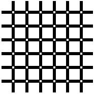
very different appearances based on how they are colored. Even in the black and white picture
below, if you look closely, you will see that the small white squares appear brighter than the
larger ones.
Student: Yes, I see that. Why does it happen? Mentor: To begin with, color has three properties we need to learn: hue, value and contrast. Hue means the name of the color, and value refers to how bright or dark the color is. Contrast is how much the colors in an object are set off from each other. Student: How would hue, value and contrast be important for tessellations? Mentor: Using color in tessellations can make a tremendous difference in how they appear. To experiment with this, design a shape starting with a rectangle in the Tessellation activity and choose black and white as the colors. Then edit the same shape, and this time use blue and green as the colors. Because there is much less contrast between blue and green, those colors will appear to blend into each other, whereas the black and white stand out from each other very much. Student: How did you know which colors contrast a lot and which ones don't? Mentor: If you look at a color wheel,
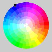
you will see the colors arranged in a circle. If you choose two colors across from each other, they will have a very high contrast. Colors next to each other on the color wheel will have a low contrast. Black and white are opposite colors, so they have a very high contrast. Student: (observing tessellations of different colors) Yes, I see what you mean. Mentor: Here is one last thing to observe. Colors can be divided into two categories: warm and cool.
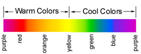
Warm colors appear closer to the foreground of a picture, while cool colors seem to recede into the background. This effect can also be observed with value. A bright color will appear closer to the eyes than a dark color. A bright blue will appear closer to the eyes than a dark red. In these pictures, the red and pink colors seem closer to our eyes than the greens and blues. The bright blue appears closer than the dark blue:
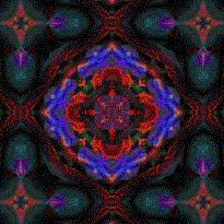

Student: Yes, I see that! And in the tessellation with the large and small white squares, the smaller squares appear to be closer to the eye than the large ones, because the small ones appear to have more black surrounding them. Mentor: Good! Now you are ready to try applying what you have learned to make some observations about this picture:
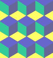
|

